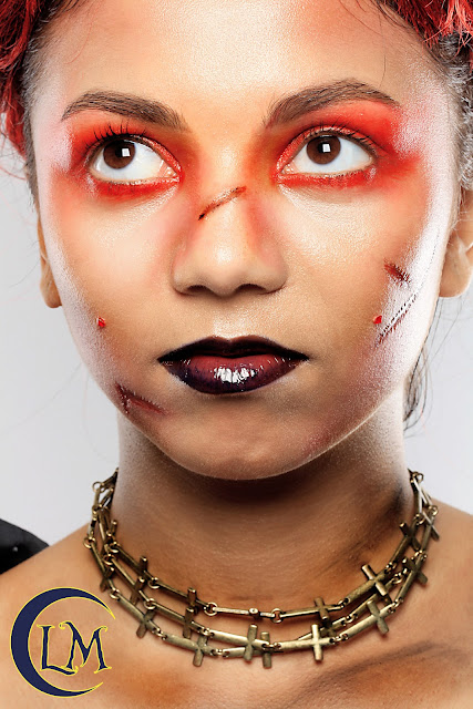
My first look I've created on wonderful model (and my class mate) Trine:
(First two photographs I edited on Photoshop CS6. Also, check out how do you like my new logo!)
:-)
Unfortunately, Trine-Mary the Warrior did not make it into my Final Photographs.
Please check out three bottom photographs of Trine-Mary the Warrior. Although, I did not edit them in great depth they are good comparison:
Although, Trini is a beautiful model my tutor Sharon is suggested to redo this look. Sharon preffered the look I practiced on myself. Here is one shot from my iPhone for the comparison:
Suggestions and notes for improvement:
No scars on face
Change styling, bulk up the body with some aged torn clothing (maybe t-shirt)
Crate more visible scars, i.e across the chest area, or multiple small cuts
Eyes - add more yellow tint, highlight
Bleached eyebrows, or no eyebrows
Maybe small cut on the lower lip
Tick, tick, tick,tick...


No comments:
Post a Comment